Pie charts are a popular way to represent data in Excel. They are a great tool for displaying information in an easy-to-understand visual format. In this post, we will show you how to create a pie chart in Excel and customize it to your liking.
How to Make a Pie Chart in Excel Video

Step-by-Step Guide How to Make a Pie Chart in Excel
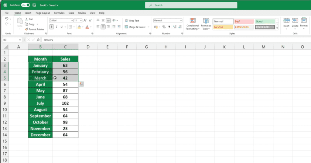
Step 1. Select the data you want to use for the pie chart.
Step 2. The data should be in a table format, with one column containing categories and another column containing corresponding values.
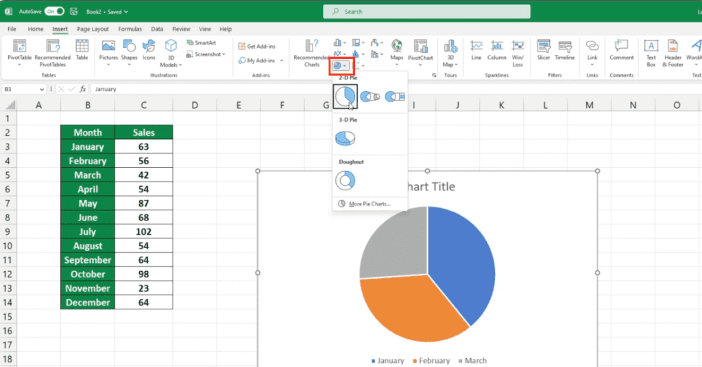
Step 3. Go to the Insert tab and click on the Pie Chart icon.
Step 4. Excel will display a list of different chart types. Choose the type of pie chart that best fits your needs.
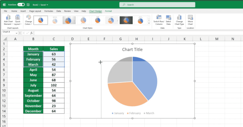
Step 5. The pie chart will appear on your worksheet.
Move Pie Chart Location in Excel
To move the location of a pie chart in Excel, follow these steps:
- Click on the pie chart to select it.
- Click and drag the chart to the desired location on the worksheet.
- You will see a dotted line around the chart as you drag it. Release the mouse button when the chart is in the desired location.
Alternatively, you can also use the arrow keys on your keyboard to move the chart in small increments.
To do this
- Click on the chart to select it.
- Use the arrow keys on your keyboard to move the chart up, down, left or right. Each key press will move the chart by a small increment.
- Release the keys when the chart is in the desired location.
Adjust Pie Chart Size in Excel
To adjust the size of a Pie Chart in Excel, follow these steps:
- Click on the Pie Chart to select it.
- Hover the mouse cursor over any of the edges of the chart until you see a double-headed arrow.
- Click and hold the left mouse button while dragging the edge of the chart to resize it.
Alternatively, you can also adjust the size of the chart using the “Format Chart Area” pane on the right side of the Excel window.
- To open the pane, right-click on the chart and select “Format Chart Area” or click on the “Format” tab on the ribbon and select “Format Chart Area”.
- In the “Format Chart Area” pane, you can adjust the height and width of the chart by entering specific values in the “Height” and “Width” boxes or by using the arrows next to the boxes to increase or decrease the size.
- Click “Close” when you are satisfied with the new size of the Pie Chart.
Keep in mind that resizing the chart can affect its readability, so make sure to find a size that is appropriate for your data and purpose.
Change Pie Chart Title in Excel
Here are the steps to change the title of a Pie Chart in Excel:
- Click on the Pie Chart to select it.
- Click on the Chart Title once to select it.
- You will notice that the Chart Title has a box around it and a small handle on the right side.
- Click on the handle and drag the title to the location you want it to be.
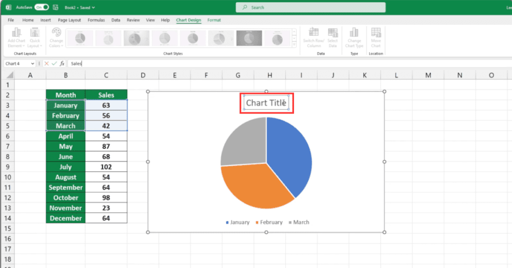
- Double-click on the Chart Title to edit the text.
- You can now type in the new title for your Pie Chart.
- Press Enter to save the changes.
Alternatively, you can also change the title of the chart from the Chart Elements dropdown in the Chart Design tab of the ribbon:
- Click on the Pie Chart to select it.
- Now, Click on the Chart Design tab in the ribbon.
- Click on the Chart Elements dropdown.
- Check the box next to Chart Title to add a title to your chart.
- Click on the newly added Chart Title to select it.
- Double-click on the Chart Title to edit the text.
- Type in the new title for your Pie Chart.
- Press Enter to save the changes.
Choose Different Pie Chart Color
To pick a different color for a pie chart in Excel, follow these steps:
- Select the pie chart by clicking on it.
- Go to the “Chart Tools” section in the Excel Ribbon.
- Click on the “Format” tab.
- In the “Current Selection” group, click on the “Chart Elements” dropdown menu and select “Data Labels.”
- Click on the “Data Labels” dropdown menu and select “More Options.”
- In the “Format Data Labels” dialog box, go to the “Label Options” section.
- In the “Label Colors” dropdown menu, select “Label fill and border colors.”
- Choose the desired color from the color palette or select “More Colors” to choose a custom color.
- Click “OK” to apply the new color to the data labels and the pie chart.
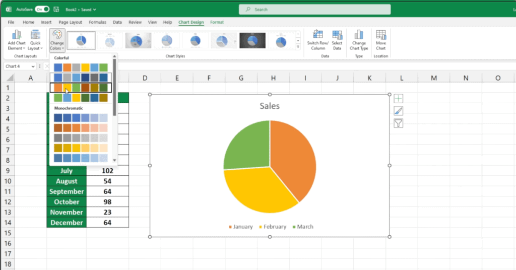
Note: You can also change the color of the chart itself by selecting the chart and going to the “Format” tab in the Chart Tools section of the Excel Ribbon. From there, you can use the “Shape Fill” and “Shape Outline” options to change the color of the chart background and border.
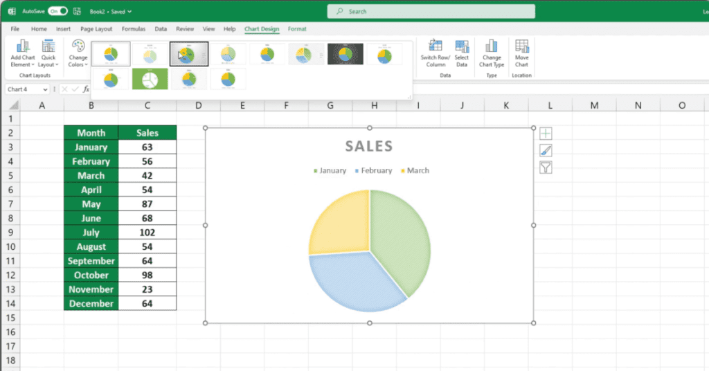
Change Pie Chart Style
To change the Pie Chart Style in Excel, follow these steps:
- Select the Pie Chart by clicking on it.
- Click on the Chart Design tab in the Excel Ribbon.
- In the Chart Styles group, you will see a variety of styles to choose from.
- Hover over the different styles to preview what your chart will look like.
- Click on a style to apply it to your chart.
- If you don’t see a style that you like, click on the More button (represented by three dots) to see additional styles.
- You can also customize the style further by clicking on the Chart Elements and Chart Styles buttons in the Chart Design tab to add or remove chart elements, change colors, and more.
- Once you are satisfied with your Pie Chart, save your work and exit.
That’s it!
By following these steps, you can easily change the Pie Chart Style in Excel to create a chart that fits your needs.
Pie Charts Are Dynamic
Yes, Excel Pie charts are dynamic, which means that they update automatically as the data in the underlying worksheet changes. This is because the chart is linked to the data source, and any changes made to the data are reflected in the chart.
For example, if you change the values in the source data, add or remove a data point, or update the chart title or labels, the Pie chart will automatically update to reflect these changes. This is a useful feature because it saves time and effort, as you don’t have to recreate the chart each time the underlying data changes.
Additionally, if you have multiple Pie charts based on the same data range, any changes made to the source data will automatically update all the linked charts, ensuring consistency across your reports and presentations.
However, it’s important to note that certain changes made to the chart itself, such as the formatting or layout, may not be automatically updated when the source data changes. In these cases, you may need to manually update the chart to reflect the changes in the data.
Things to Keep in Mind
- Make sure your data is organized into a table with one column for categories and another column for corresponding values.
- Choose the right type of pie chart that best fits your needs.
- Customize your pie chart by adjusting its location, size, color, title, and style.
- Remember that pie charts are dynamic, and they will update automatically when you change the data in your table.
Excel is excellent at displaying data and if you want to learn more about Excel my site is here to help you.